
I begin by simply added a black square to a letter size page.

Then I add another square and define it with two different colors.

Next I create a circular shape and color part of it blue and the other section black.

I decide to add an olive color to the uper left portion of the original square.
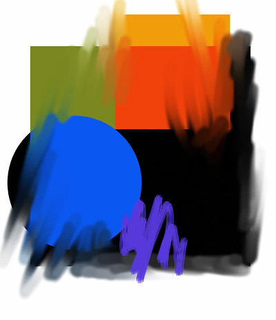
The previos images were all done in Photoshop Elements 2.0. I n ow open the last image in Painter Classic and soften and blend certain areas using different brushes and the water tool.
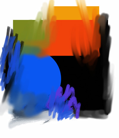
I further blend and also add more color brushstrokes.
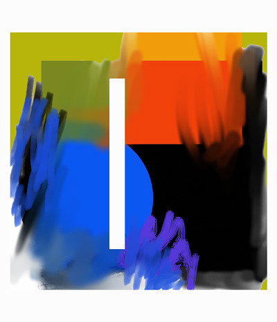
I crop the image and change some of the colors and add a white shape to the composition.
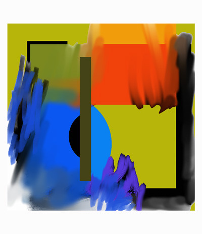
I color the white shape a dark brown and change a few of the colors, added a coupe more shapes and am finished. I could keep going, but am satisfied with the image at this point. This is a fun way to practice and to learn about design and color. I've created hundreds of these types of images and it's been a great help for me to learn about the Photoshop and Painter Classic tools and how they work. Even if you hate abstractions it's still a worthwhile endeavor to experiment this way.

No comments:
Post a Comment