Thursday, June 30, 2011
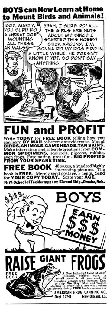
Old ads from the 1930's
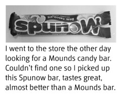
I love some of these old ads that used to run in various magazines when I was a kid. Once in a while I'll rewrite the copy in the balloons and send the ads to friends.


Tuesday, June 28, 2011
Color variations on a composition
Taking an existing painting or illustration and trying different color variations can be a very interesting project and is a good way to hone your computer skills. Just let your imagination run wild and see what happens.
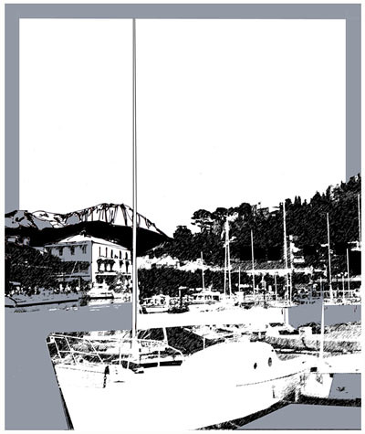
Above is one of 36 black and white illustrations that I did for Ben Leibson's book, "Drifting Sands". It was created on a Mac 4 computer. Many interesting variations can be created of an image like this easily in photoshop, it's interesting as well as a great learning experience.
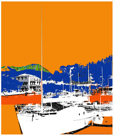
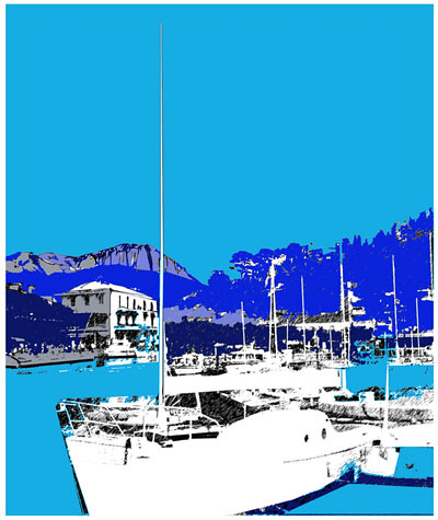
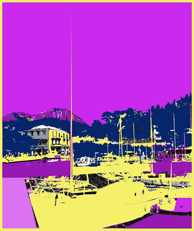
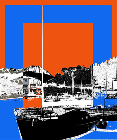
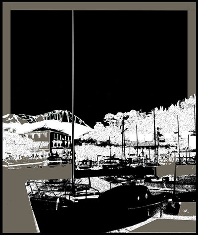
Here's another black and white version, I could have gone on and done dozens of these, the computer makes this type of experimentation comparatively easy.

Above is one of 36 black and white illustrations that I did for Ben Leibson's book, "Drifting Sands". It was created on a Mac 4 computer. Many interesting variations can be created of an image like this easily in photoshop, it's interesting as well as a great learning experience.


Here's another black and white version, I could have gone on and done dozens of these, the computer makes this type of experimentation comparatively easy.
Monday, June 20, 2011
Having fun with a digital image
Don't be afraid to experiment, the computer is a wonderful medium for altering images and changing colors. Here is an image consisting of two figure studies which I will use as an example of how I typically experiment with color and design.
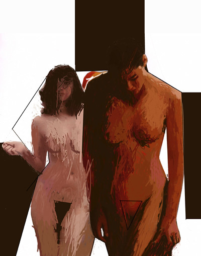
Here is the basic image that I started with.
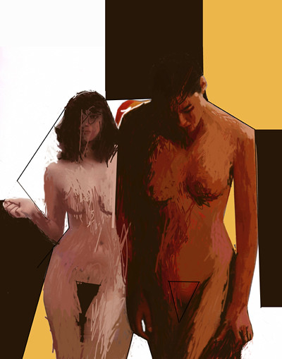
First I just added a yellow color.
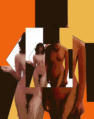
Next I made a 50% copy of the original and positioned it over the larger image and added tone of orange.
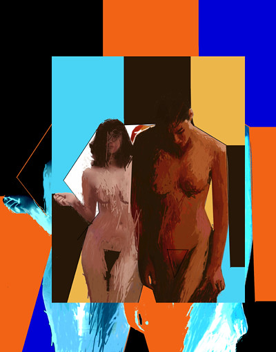
Here I placed a 75% image over a negative image and added a few more colors.
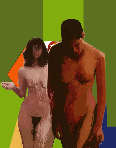
In this version I tried a whole new color scheme.
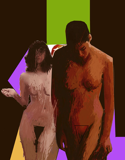
In this last version I added a dark brown and a light purple color tones, again changing the whole look of the piece. I could keep going on, of course, as it's quite easy to do this type of thing on the computer, something that would take days or even weeks to create using traditional mediums such as acrylic or oil paint.

Here is the basic image that I started with.

First I just added a yellow color.

Next I made a 50% copy of the original and positioned it over the larger image and added tone of orange.

Here I placed a 75% image over a negative image and added a few more colors.

In this version I tried a whole new color scheme.

In this last version I added a dark brown and a light purple color tones, again changing the whole look of the piece. I could keep going on, of course, as it's quite easy to do this type of thing on the computer, something that would take days or even weeks to create using traditional mediums such as acrylic or oil paint.
Saturday, June 18, 2011
New exhibition
"Medical Marijuana" is a new group exhibit at the Scarlet Macaw Community Art Center in Sawyer. Michigan. The three digital prints below are my entrees. I found some old engravings that I used to create these images. They were scanned into the computer where I added the color and type.
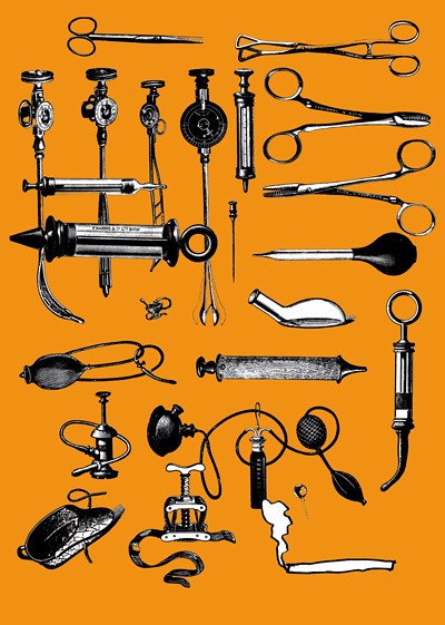
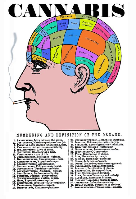
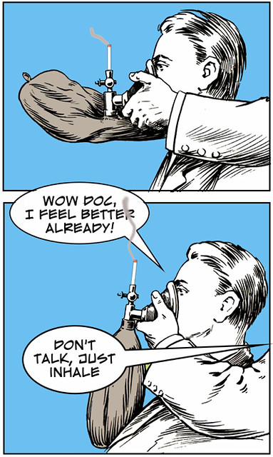
These images were a lot of fun to create as always.


These images were a lot of fun to create as always.
Thursday, June 9, 2011
Photo into abstract design
As you probably know, I love to experiment with design and color, and the computer is the perfect medium for creative endeavors.
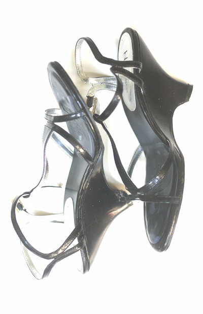
I posted a few photographs of shoes on my other blog and I will use this one for my demonstration.
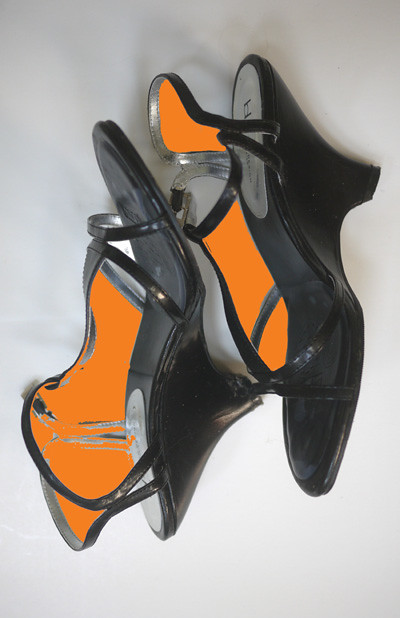
I first decided to add a few orange areas to the composition.
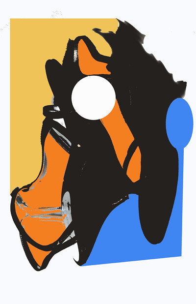
Then I added the dark yellow and blue colors. I decided to add a white circle and the oval in the blue. I also made the shoe areas a solid black and changed the shape of the top of the right shoe.
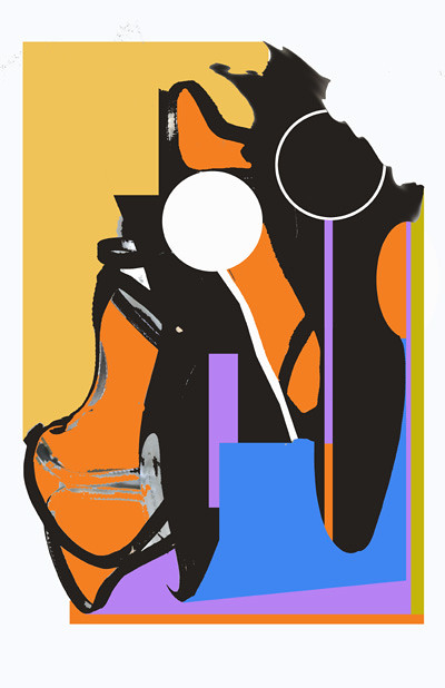
I didn't like the spoon type shape in the blue, so I changed that. I added a purple color to the design as well as another circle shape. Then a couple of colors on the lower and right borders, finishing the design. I didn't really have anything specific in mind when I began, I just used the basic shapes of the shoes as my starting point.

I posted a few photographs of shoes on my other blog and I will use this one for my demonstration.

I first decided to add a few orange areas to the composition.

Then I added the dark yellow and blue colors. I decided to add a white circle and the oval in the blue. I also made the shoe areas a solid black and changed the shape of the top of the right shoe.

I didn't like the spoon type shape in the blue, so I changed that. I added a purple color to the design as well as another circle shape. Then a couple of colors on the lower and right borders, finishing the design. I didn't really have anything specific in mind when I began, I just used the basic shapes of the shoes as my starting point.
Tuesday, June 7, 2011
Thursday, June 2, 2011
Subscribe to:
Comments (Atom)
